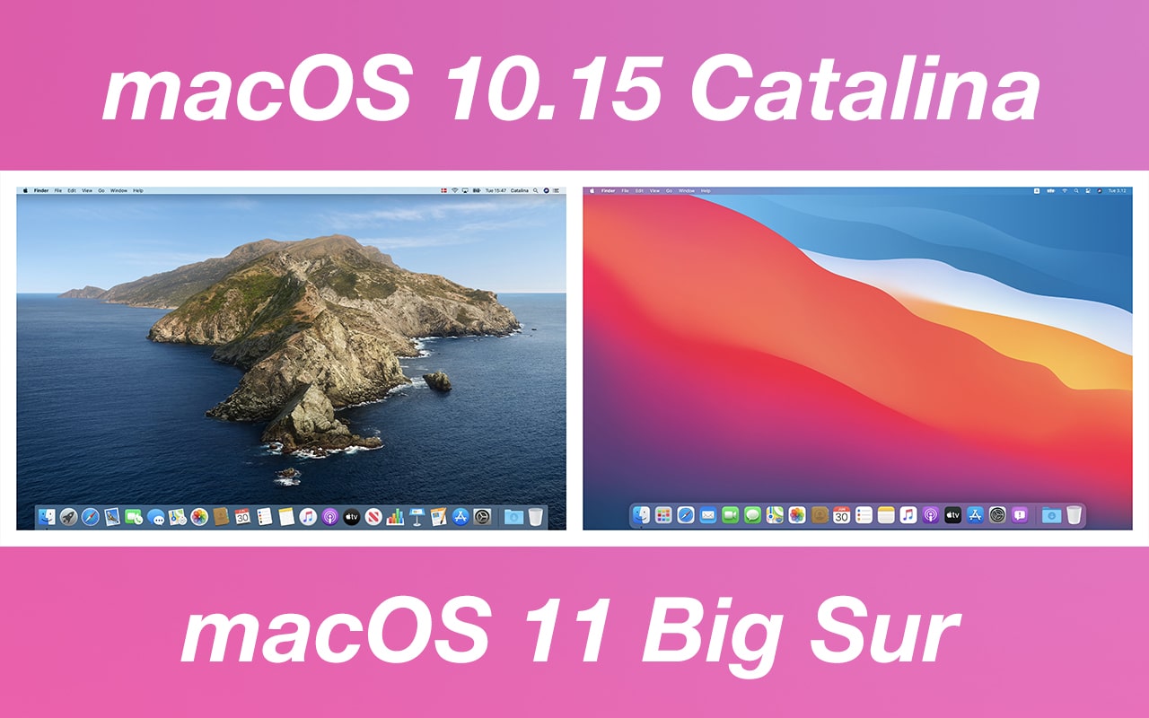
Apple unveiled the biggest update to macOS in years, introducing macOS Big Sur during the first online-only WWDC keynote last month. The macOS Big Sur Beta 1 update was released just after the WWDC keynote. Now, a developer has posted detailed side-by-side comparison images of macOS Catalina vs. macOS Big Sur to showcase design changes between the two versions.
The macOS Big Sur update brings a major redesign to Apple’s desktop operating system, and it now looks more like iPadOS. Developers are still gauging the difference it will make on their apps, and developer Andrew Denty has done a detailed and extensive study of the UI design differences between macOS 10.15 Catalina and macOS 11 Big Sur.
The side-by-side UI design comparisons include changes to the Desktop, Finder, Preview, System Preferences, Menu Bar, Notification Center, Control Center, Activity Manager, Safari, Calendar, Contacts, Reminders, Notes, Photos, Apple Music, Podcasts, and other utilities and stock apps. The developer notes that icons now look more cartoonish, and they’re all based on a rounded square, but some elements protrude from them, giving a sense of extra depth.

The comparison shows how Apple is moving iPadOS and macOS towards each other, and bigger default icons and UI elements hint towards a possible touchscreen Mac in the future. The developer also notes that many features and options are now displayed by default inside application windows with macOS Big Sur, making the UI look comparatively messier.

The developer says that he didn’t find the redesign as dramatic as he first thought. He mentions that macOS Big Sur feels like an incremental update to make macOS feel more coherent with iOS and iPadOS. He also thinks that Apple still has a vast amount of work to do before it can release the final version of macOS Big Sur. Particularly, he mentioned that the company needs to work on path bars and status bars, which feel out of place in the current beta version of macOS Big Sur.
For more comparison images, you can head over to Andrew Denty’s website by clicking the source link at the end of this article.
Our Take
Having a look at all the comparison images reveals that Apple still hasn’t found the perfect way to include iOS and iPadOS inspired UI elements into macOS’ interface. The company might take multiple iterations to perfectly blend iOS-inspired elements into an operating system that’s meant for desktops.
[Source: Andrew Denty]