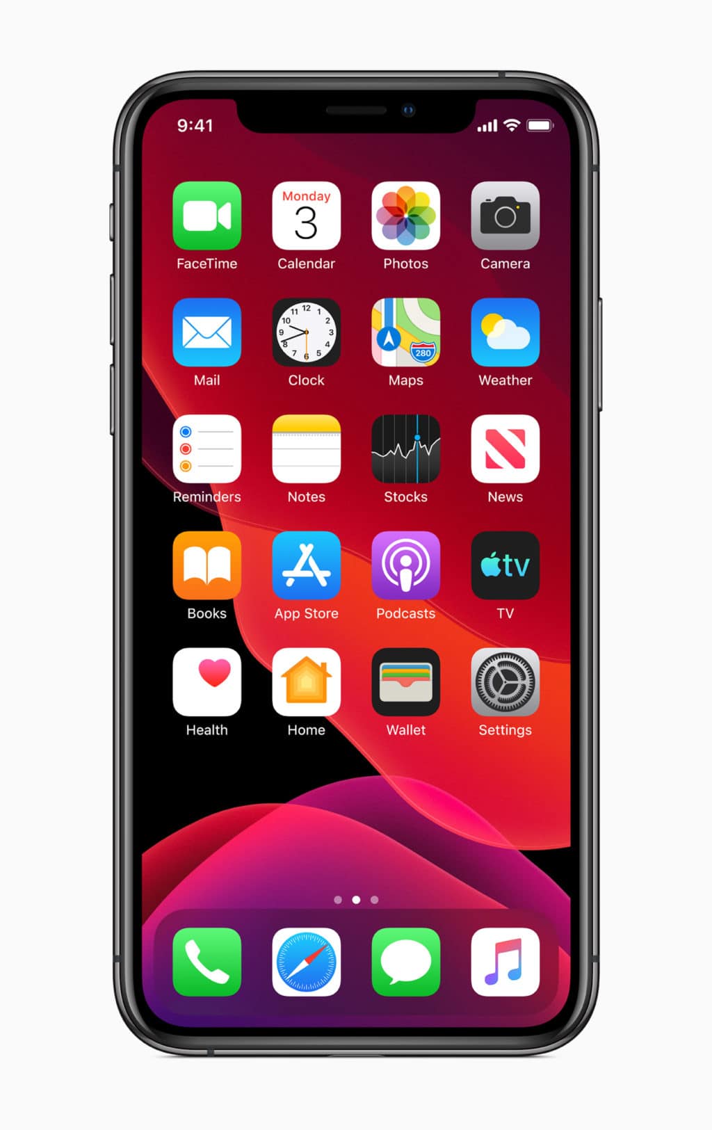
iOS 13 is a massive update that introduces a plethora of new features and enhancements. It comes packed with a number of major new features and enhancements aimed at improving the overall usability of the OS. Despite packing some major headlining features though, iOS 13 does little to improve the home screen experience on the iPhone.
The iOS home screen last got a meaningful update of any sort with iOS 9 in 2015. Since then, the home screen has looked pretty much the same — a grid of icons — despite iPhones itself changing dramatically. Since 2017, iPhones have switched over to OLED displays, almost become bezel-less and the iPhone home screen has only received new wallpapers since then as a part of every major iOS release.
Here’s how the home screen on iOS 13 looks like:

iOS 12 Home Screen:

iOS 10 and iOS 11 Home Screen:

So, from September 2016, the iPhone home screen has looked and behaved exactly the same. Apple has made certain UI tweaks, but they are minor at best and did nothing to improve the overall information density or usefulness of the home screen.
On the iPad, the grid of apps icons felt woefully inadequate with extremely low information density. The row of icons on the 11-inch and 12.9-inch iPad Pro looked hilariously bad and nowhere near offered a ‘pro’ experience that the name or the price tag commanded. By branching out iPadOS 13 from iOS, Apple has at least fixed that issue to a certain extent. The tighter grid of icons along with the ability to pin widgets on the home screen means that the iPadOS home screen now has a greater information density and makes better use of the available screen real estate.
In one glance, I can have a look at my upcoming calendar appointments, quickly trigger a shortcut, get ETA notifications from Apple or Google Maps, and more. It might seem like a relatively small change but it has a massive impact on the overall usability.

Apple should have done something similar to the iPhone’s home screen with iOS 13. The row of icons is simply inadequate in this day and age, especially on the likes of the iPhone XR and iPhone XS Max which come with 6-inch+ displays. I understand that due to screen size constraints, Apple will not allow pinning of widgets on the iPhone’s home screen. But that’s no excuse for the company to not fix the poor home screen experience on an iPhone.
With iPadOS 13 getting a functional home screen refresh, I have no doubt in my mind that Apple is working on an iPhone home screen refresh as well. It will likely come out as a part of iOS 14 in 2020, but that’s another year of waiting for something which Apple could have rolled out this year itself. The iOS Home Screen plays a key role in the overall iPhone experience and its a shame that Apple has not improved it in years now.
Are you happy with the home screen experience offered by iOS? Or you do think it is in dire need of a refresh? Share your thoughts with us in the comments section below!