Hardware wise, the iPhone X is the best phone Apple has ever made. Apple made a lot of bets with the iPhone X. The bezel-less display, the notch, the new software gestures. And Apple has mostly pulled off the hardware changes. But it’s the software reshuffling in iOS which has been less-than-stellar. So many features like Control Center gesture feel like they’re bolted on.
There’s not much Apple can do with the hardware but we hope that Apple improves the software with iOS 12 to make life a little bit easier for iPhone X owners (and for the upcoming iPhone 11).
#1. Control Center Placement

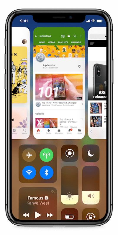
Even after 6 months of everyday use, I’m still not used to the new Control Center gesture. It’s always awkward and takes way too much time and effort. Apple needs to rethink the Control Center placement in iOS 12, or the Control Center itself.
One concept that’s been going around is the possibility of merging the Control Center and Multitasking in one pane.
#2. Battery Percentage in Status Bar

Right now, you need to swipe down from the right ear to view the battery percentage. There’s no option to enable percentage view in the status bar. I think that if Apple wanted to, they could replace the battery icon with percentage text. And we’re not asking it to be the default Apple! Just give us battery anxious users an option!
#3. Face ID Reliability
Face ID’s performance depends on the A11 Bionic Chip. But it feels like Face ID is not making use of all the available power. A11 is a mighty chip but Face ID is still just a bit slow. Apple should put some resources in iOS 12 to make the interaction and animations with Face ID faster.
#4. Lock Screen Complications

Apple should also bring Apple Watch’s complications concept to iOS. Right below the clock, third-party apps can add complications for the weather, calendar events, reminders, time zones and so on.
#5. Ambient Mode
iPhone X has an OLED screen. If Apple wanted, they could add an Ambient mode similar to what Android devices have. So if you lift up the iPhone, you’d see the time, date and some complications. The rest of the screen would still be blank. Apple could show notification dots here, and even the 3D Touch shortcuts at the bottom.
#6. Customizable 3D Touch Lock Screen Shortcuts
Right now, there are two shortcuts at the bottom of the screen – Flashlight and Camera. The Camera shortcut is useless because a quick left swipe opens the Camera anyway (which is a much faster interaction).
Apple should let users customize the buttons here, even if the list of options is limited. I would love to open the Control Center from one of these shortcuts.
#7. Emoji Bar Below The Keyboard

This was suggested right after the iPhone X came out and it still makes sense. When the keyboard is propped up, there’s a huge space between the Home bar and the Spacebar. Apple already has two icons here at both ends. If Apple wanted, they could put a sliding emoji bar right here. It would make typing your frequently used emojis much better.
#8. Picture-in-Picture

Maybe it doesn’t make sense for 4.7 inch iPhones but for the iPhone X and the Plus models, Apple really needs to include iPad’s Picture in Picture mode. The technology is right there. It can work just the way it does on the iPad.
#9. Split Screen in Landscape Mode

The iPhone X’s screen is super tall. And if the rumors are to be believed, the next iPhone will have an even bigger and taller screen. Apple should bring iPad’s Split View technology to the bigger sized iPhones. It won’t be for everyone but the productivity users will get a lot out of it.
#10. Much Better Portrait Lighting

iOS 11 introduced the Portrait Lighting feature. It works on top of Portrait Mode that was made popular by iPhone 7 Plus. While Portrait Mode is pretty good, Portrait Lighting.. really isn’t. The feature almost always results in weirdly blurred edges on the face, especially when using the Studio Mono effects.
Portrait Mode wasn’t great when it first started out. So there’s hope for Portrait Lighting feature as well. We hope it gets better with iOS 12 update.
#11. Better App Quitting
Because of iPhone X’s Home gesture, the App Switcher no longer supports the swipe up to quit gesture. While it’s a great way to stop users from compulsively quitting apps, it’s also quite annoying. You need to tap and hold on an app and then you can swipe up to quit the app. We hope Apple brings back the old behavior with iOS 12.
Read more: How to Kill or Force Quit Apps on iPhone X
#12. Annoying Software Fixes
iOS 11 on iPhone X is fast, fluid and reliable except for a couple of really annoying bugs. 3D Touching icons in the bottom row on my iPhone X is almost impossible. And there’s always a 5-10 second delay whenever I get a call. The new Now Playing widget behavior on the Lock screen is buggy as well.
#13. Dark Mode

And of course, no iOS wishlist would be complete without a plea for the dark mode. Now that the iPhone X has an OLED screen and so many apps support dark mode, it’s time for iOS to integrate this feature as well.
And it’s not like Apple has never tried this before. The Apple Watch is a great example of a dark UI done right. Even Apple TV now has a dark mode. So does the Mac! The only platform left is iOS. And even there, Apple has used the Smart Invert feature to bring a pseudo-dark mode that does work in Apple’s app and apps which comply with Apple’s accessibility requirements. Come on Apple, you’re so close!
Your iPhone X Wishes
What do you hope and wish Apple fixes with iOS 12? How do you want the iPhone X software to get better on iOS 12? Share with us in the comments below.
Check out the other features in our iOS 12 wishlist
- A Better Notification Center
- 10 Features We Want in FaceTime and Messages Apps