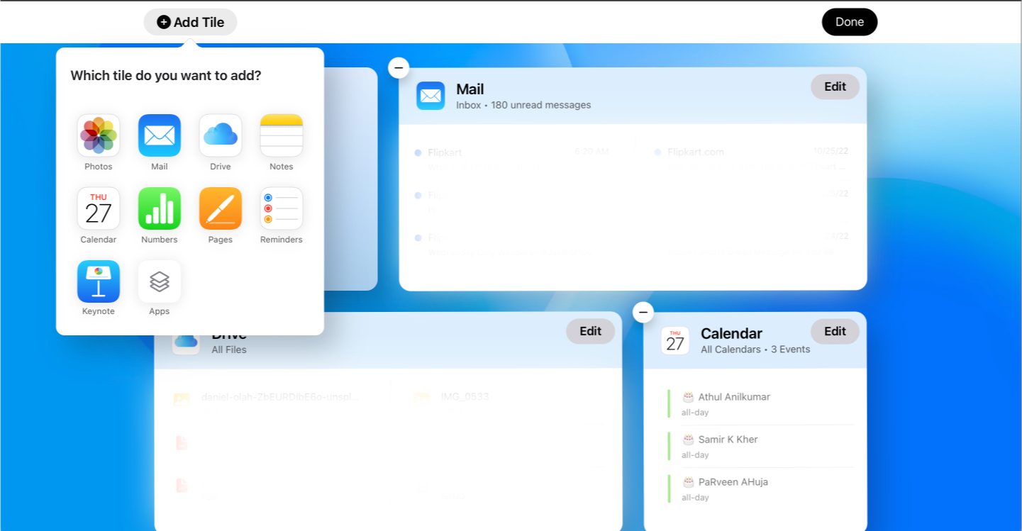
Apple is testing a new design for the iCloud.com website. The new website looks much better compared to the current version, and you can try it out starting today.
The new design features big tiles with previews for Photos, Mail, iCloud Drive, Notes, and more. Users can customize the look of the iCloud homepage according to their preferences. There is also an option to create new event, Pages document, Numbers sheet, and more towards the right top corner.
Cliking on the app icon takes the user to that particular app’s web app. Unfortunately, web apps still use the older design. In addition to customizing the Home Page, users can also manage their Apple ID settings and iCloud plan right through the dashboard.
Apple has been working on improving iCloud for the past few months. The company recently integrated iCloud Photos and Drive to Microsoft’s Windows 11 and now is testing a new design for its website.
While the feature is still in beta, you can access the new iCloud design at beta.icloud.com. The beta iCloud website is used by Apple to test new features and changes before they are rolled out to more people.
Have you tried the new look? What are your thoughts on the new iCloud.com look? Share them in the comments section down below!
Via: MacRumors
