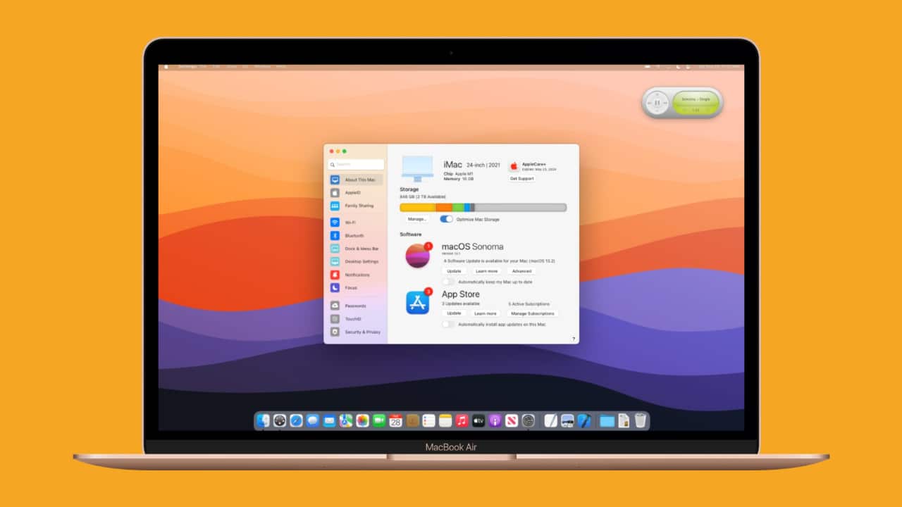
Over the years, macOS has received several improvements. Although the user interface was significantly overhauled with macOS Big Sur, critical elements such as the System Preferences were not refreshed. A new concept from The Basic Apple Guy shows what the menu could look like if it gets overhauled along the lines of the iPhone Settings app.
The concept creator admits that although iOS and macOS are considerably different, one can try to “create coherence between platforms.” System Preferences was the ideal demonstration because it lacked fundamental adherence to Apple’s current design philosophy on macOS Monterey. For instance, the present System Preferences icon doesn’t resemble the Settings icon on iPhone, and similarly-named categories contain different settings on both the operating systems. Mac’s General category allows you to tweak accent colors, toggle light and dark mode, and set the default browser. In contrast, the General category in iPhone settings provides options for software updates, AirDrop, iPhone storage, Date and time, and more.
A Breath of Fresh Air
Basic Apple Guy’s concept starts by renaming System Preferences to Settings. The panel-based user interface has been swapped for a contemporary design that relies on a sidebar for menu navigation. The sidebar allows for quick and easy access to several settings while providing a cleaner, organized appearance.
The concept design also arranges settings into categories that would fit better. For example, software, AppleCare, and storage management are accessible under the “About This Mac” tab and “Desktop Settings” curates all the features in a single scrollable window instead of obscuring them behind several System Preferences icons.
The concept design segregates all Bluetooth devices by type in the “modernized” panel. Just like on Windows, you’ll be able to see your AirPods under “Audio Devices” and other devices under “Peripherals.” The section for audio gear displays helpful information, such as battery stats for each accessory.
Our Take
Apple usually unveils the new version of macOS at WWDC, which is just around the corner. macOS Monterey was a relatively minor upgrade. We could witness some UI changes in the upcoming update alongside some new feature additions as well. Hopefully, the changes make System Preferences less intimidating for new and experienced users alike.
Do you like the style of changes showcased in this System Preferences concept design? What other changes would you like to see? Tell us in the comments section!
[Via The Basic Apple Guy]

