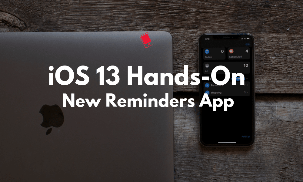
The old Reminders app was getting a bit long in the tooth. It hadn’t been updated since iOS 7 days and it just didn’t look right on the new iPhones. Now, Apple has redesigned the whole Reminders app, rebuilding it from the ground up. It now revolves around four new sections, powerful lists, and natural language processing. In total, the new Reminders app is much easier to use, and a lot more powerful. Take a look at all the new Reminders feature in our hands-on post below.
Reminders App in iOS 13 and iPadOS 13: All the New Features
In this post, we are covering the new Reminders app in iOS 13 and exploring its features in-depth. To learn about the new features in iOS 13 and iPadOS 13, check out our lists for What’s New in iOS 13 and What’s New in iPadOS 13.
Natural Langauge Processing

One of the biggest reasons for using third-party to-do apps like Todoist and TickTick was natural language processing. Now, it works in the Reminders app too. You can now type out a whole reminder like “doctor’s appointment at 8 PM on Thursday” and you’ll see a suggestion to add the given date and time to the reminder in one click. Your default reminder notification rules will apply. What used to take 5-6 taps in the old app, now takes just one tap.
New Hub Based UI

The old Reminders interface revolved around sliding panels as lists. Now the new interface revolves around the Hub. When you open the Reminders app, you won’t see any reminders. Instead, you’ll see a section at the top with four filters for reminders: All, Today, Scheduled and Flag. Tap on it view reminders that qualify those filters.
Below the four buttons, you’ll find your lists. You don’t have to use lists to manage your reminders. Predictably, all new reminders go to the list called Reminders (you can change this from Settings). You can tap on the Add List button to create a new list with a distinct color. If you’re going to be using Reminders a lot, it makes sense to use Lists.
The new UI looks especially great on the iPad. The filters and lists are docked on the left side permanently, making it easier to switch between lists. Not to mention that the Reminders app looks great in dark mode. The blue accent color is good for readability as well.
Quick Toolbar with Attachments

When you’re creating a new reminder, you’ll see a quick actions toolbar above the keyboard. There are four icons here, Time, Location, Flags and Camera.
Tap on the Time icon to quickly select if the reminder is due today, tomorrow or this weekend. From the Location button, you can select if the remainder will go off when you’re getting in your car or when you’re leaving the current area. Tap on the Flags icon to flag and task. To add photo attachments to the reminder, click on the Camera icon.
Grouped Tasks and Lists
The Reminders app’s new list view looks like the Things app. And that’s a good thing. It’s clean and beautiful. And you can add sub-tasks to reminders as well now. According to Apple you can “Just drag and drop or swipe to add smaller tasks under a larger reminder. You can also group multiple lists together.” But in iOS 13 Beta 1, I was not able to get this feature working. It might be a bug or it could be added in the next couple of betas.
Reminders Suggestions in Messages
If you tag a contact in a reminder (from the info view), you’ll get a reminder about it when you’re chatting with them in the Messages app.
A Much Needed Upgrade
Overall, the Reminders app is now a lot more usable. It was a much-needed upgrade. Thanks to the grouped reminders feature, natural language processing, and the filters, the new Reminders app is something you can use instead of TickTick or Todoist and it is going to be easy to recommend to your friends as well.
Here are a couple of other noteworthy tidbits about the Reminders app.
- You can share a specific reminders list with someone.
- There’s a new widget with a big Add Reminder button.
- There’s no way to quickly add a reminder from the hub page. You have to select a list to get to the New Reminder button.
Take a Look At Our Other Hands-on Posts
This post is part of our on-going Hands-on series where we try and talk about the new features in iOS 13 and iPadOS 13. Take a look at some of the other posts we’ve done so far:
- iPadOS 13 Hands-on: New Multitasking Features
- iPadOS 13 Hands-on: New and Improved Files App
- iOS 13 Hands-on: New Find My App
What do you think about the redesigned Reminders app? Is the overhaul enough to make you switch to it as your default to-do app? Share with us in the comments below.