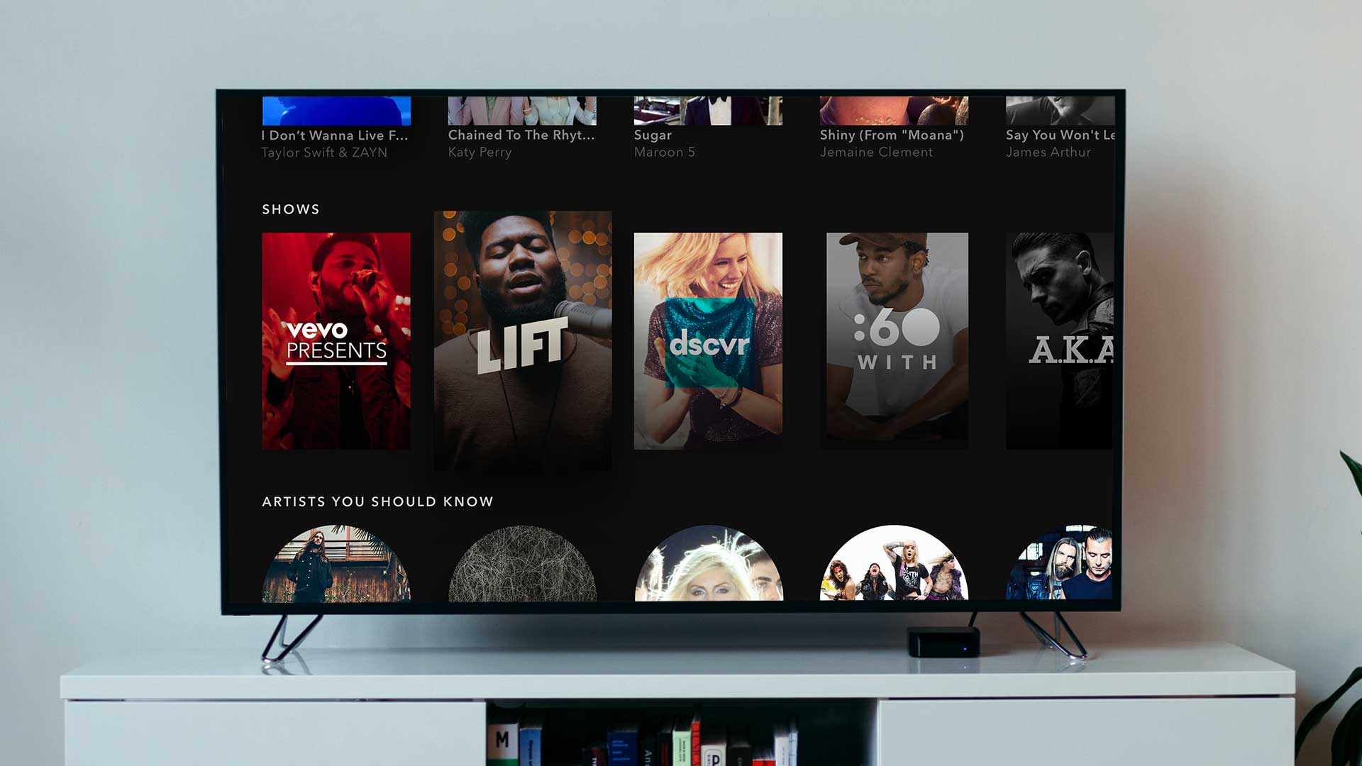
Vevo today released a revamped Apple TV app with a simpler interface that provides a new level of personalization and curation for music video lovers.
Vevo says that the new design and layout of the app will allow viewers to quickly access their playlist and videos, with the ability to browse around in the app while listening to a playlist or video thanks to the “peek-inside-playlist” UI.
The app will also learn as you use it more to offer a more personalised experience. It will now also come with curated playlists by the in-house editorial team at Vevo.
The key new features of the update are as follows:
- New design and layout that gets you to playlists and videos you’ll love and into an immersive, lean-back experience as soon as you open the app.
- Artist stations to fit your tastes and moods.
- The ability to browse while listening to a playlist or artist station or video, with our unique “peek-inside-playlist” UI that allows you to preview what’s inside a playlist.
- Programming curated by our in-house editorial team that’s perfect for the time of day and the big events and holidays.
- Completely localized playlist experience by genre and market.
- An experience that evolves with you; the more you use Vevo, the more personalized the experience will become.
- Fluid playlist controls that enable you to navigate through a playlist without exiting to a static details page.
- The ability to curate your Vevo, with just a couple of taps necessary to add a video you like to your favorites section or to one of your playlists.
- A genres section that allows you to browse the top videos, trending artists and most recent playlists for the genres you prefer.
The update for Vevo’s tvOS app for Apple TV 4 will go live on Friday, May 19.
[Via Vevo]