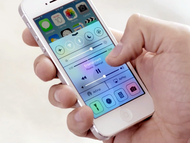
Quick access to system toggles has been one of the most requested features since a very long time or at least since SBSettings was released back in February 2009.
Apple didn’t disappoint us this year as iOS 7 will come with a new feature called Control Center that gives us quick access to system toggles and lots more.
In this iOS 7 preview series, we take an in-depth look at Control Center.
Before we go into the details here’s what Apple has to say about Control Center:
Control Center gives you quick access to the controls and apps you always seem to need right this second. Just swipe up from any screen — including the Lock screen — to do things like switch to Airplane mode, turn Wi-Fi on or off, or adjust the brightness of your display. You can even shine a light on things with a new flashlight. Never has one swipe given you so much control.
So here’s what we know so far about Control Center:
- Like Notification Center, you can access Control Center by swiping up from the bottom. You can access it from anywhere in iOS, from the Home screen, from the Lock screen and even while using an app.
- In iOS 7, there are distinct and functional layers, which help in creating depth and establishing hierarchy and order. You will notice it when you swipe up to access the Control Center. It’s a layer on top of the Home screen, the Lock screen or the app.
- The translucent/blurred background of the Control Center takes the color of what’s underneath. So if you access it from the Home screen, it will take the color of the wallpaper, with light smudges based on the color of the app icons. On the Lock screen, it takes the color of the wallpaper and in apps, it takes the color of the app background. If you access the Control Center say while using the Settings app (not the best example), it’ll get a whitish translucent background with light blue tint on the left due to the icons for various settings. It’s much better then the grey lenin background of the iOS 5/iOS 6 Notification Center.

Control Center via Lock Screen, Home Screen, Settings App
- Now coming to functionality, the top row gives you quick access to system toggles such as AirPlane mode, Wi-Fi, Bluetooth, Do Not Disturb and Orientation Lock. When you tap on the toggle to turn it on, it turns white, and you also get a message at the top informing you that the toggle has been turned On or Off. It turns black when you turn it off.
- In the next row, you have a slider for brightness. It’s quicker and a lot more functional to control the brightness from the Control Center if you’re the types who doesn’t depend or trust iOS’s auto-brightness feature.
- You then have the music playback controls, which also includes the scrubber bar, which allows you to skip to any point in a song. Apple has quite rightly removed the music playback controls from the app switcher and added it to the Control Center. It’s quicker to access and it doesn’t dilute the purpose of the app switcher, which is to access the recently used apps that are running in the background.
- In the next row, you have options to enable AirPlay or the new AirDrop feature. When you tap on the AirPlay option you can an option to stream content wirelessly to AirPlay to the Apple TV and when you tap on the AirDrop option, you get options to enable it turn it on only for Contacts or for Everyone.
- The last row gives you quick acces to turn on the LED flash, which turns your iPhone into a flashlight. You also have shortcuts for the Alarm, Calculator and Camera apps.
- You can disable the Control Center from the Lock screen via the Settings app (Settings > Control Center, tap or swipe on the Access on the Lock Screen toggle to turn it off).
Things we didn’t get:
With the Control Center, Apple has given us almost everything we wanted in our iOS 7 wish list and more, quick access to the some of the frequently used system toggles, quick access to music playback controls with the scrubber bar and shortcuts for frequently used apps or features like the Camera app, Alarm etc.
However, Control Center would have been perfect if Apple would have given us the ability to select the system toggles and app shortcuts. Also, instead of restricting the system toggles to 5 and app shortcuts to 4, we should ideally be able to scroll through a list of toggles and app shortcuts.
Overall, the Control Center is one of the best features of iOS 7. It looks quite good with the translucent background, but appears a little cluttered.
Let us know what you think of Control Center in the comments below. What other features do you think Apple should have added in the Control Center?
Related: