In this iOS 7 Preview series, we’ll take an in-depth look at iOS 7’s new features and improvements.
We start off by covering the Lock screen, which has been completely redesigned in iOS 7.
So here’s what’s new:
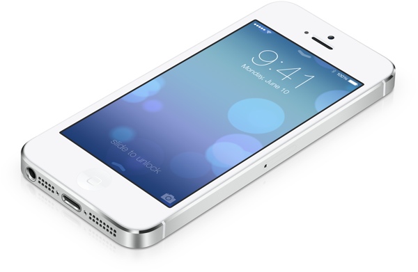
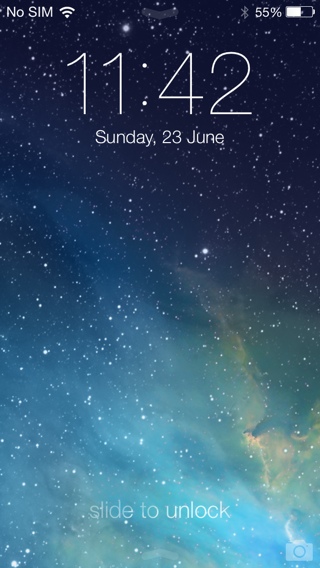
- In iOS 7, the lock screen sports a minimalistic user interface, gone is the iconic slide to unlock slider button. Instead you’re greeted with just the “slide to unlock” text with a subtle animation that highlights the text that hints at the direction in which you need to slide to unlock the lock screen.

- You can swipe from left to right on the entire Lock screen to unlock the device. You no longer need to swipe on the button.
- The camera shortcut has also been moved to the bottom right corner, which has the same bounce animation when you tap on it from iOS 6 that subtly tells the user to swipe up to access the Camera app.
- In iOS 5 or earlier, the Status bar was either black or grey. In iOS 6, the color of the Status bar changed dynamically to match the tint of the app’s navigation bar. In iOS 7, the Status bar is transparent. It subtly removes the separation between software and hardware as the status bar now feels part of the app even though it continues to provide the status of various hardware components such as the cellular and Wi-Fi signal strength, battery, Bluetooth, Location services etc.
- You can finally access the Notification Center from the Lock screen. So you can quickly check the missed Notifications and the information provided in the Google Now-like Today view such as Weather, upcoming meetings, birthdays etc, without going through the hassle of unlocking the device. If you’re worried about privacy, then you have the option to disable the Notifications View and Today View from the Lock screen. There is an arrow at the top to indicate that Notification Center can be accessed from the Lock screen.

- You can also access the all-new Control Center from the Lock screen by swiping up from the bottom of the screen. However, the arrow just below the “slide to unlock” text that is meant for the Control Center, has led many users to the frustration of sliding up to unlock.

- Apple has also revamped the way notifications are displayed on the Lock screen. The notifications are displayed in plain text and are separated with a line divider. When you get a new notification, the incoming notification is highlighted while the older notifications are greyed out. You can still swipe them individually to launch the appropriate app.

- Passcode lock screen has also been completely redesigned. Instead of the passcode lock screen sliding up from the bottom, it slides from the left, trailing your swipe. The passcode takes up most of the screen and comes with circular keys if you have set the numeric passcode. The background is translucent and takes the tint of the lock screen wallpaper.

- You can now set static and dynamic wallpapers on the Lock screen. iOS 7 beta comes with two dynamic wallpapers, which animate in the background.
- You can also set panoramic wallpapers on the Lock screen. iOS 7 uses the gyroscope movement data to pan around the panoramic image.
- Apple has added a cool 3D parallax effect to the Lock screen and the Home screen. The 3D Parallax effect makes the “position or direction of an object appear different when viewed from different angles”. We cover this in detail when we cover the Home screen.
- If you set the timer in the Clock app, then it now displays the timer in the lock screen just below the clock. You can also stop the timer from the lock screen when its done, so you don’t have the Clock app open.

- You will finally be able to skip to any point in a song from the Lock screen as the music playback controls include a scrubber bar.

- “Tap to Snooze” for Alarm now shows up as a large, plain text notification on the Lock screen instead of a popup. If you tap to snooze, then the snooze timer is now displayed on the Lock screen, which is quite neat.

- The battery charging indicator on the lock screen has also been redesigned.

Overall, the iOS 7 lock screen looks a lot more modern and comes with features such as quick access to Notification and Control Center that we’ve requested for a very long time.
Let us know what you think of the iOS 7’s Lock screen. Do you like it?