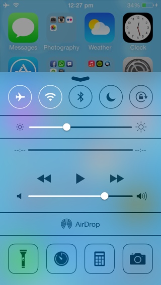
Apple released iOS 7 just over a month back, and the all-new user interface has received its fair share of criticism and even given some folks a headache.
Thankfully with the release of iOS 7.0.3, Apple has given users an option to stop the headaches.
While it may not be possible to change the icons, which some people seem to hate, there are some aspects of iOS 7 that you can be toned down if you don’t like it.
The blur or the translucent effect seen on the Control Center (as seen in the screenshot above), Notification Center, Spotlight etc is one such thing that can be turned off if you’re not don’t like it or if you’re noticing performance issues on your older iOS device. Please note the blur effect is not available on the iPhone 4.
Follow these steps to turn it off.
- Launch the Settings app, navigate to General > Accessibility > Increase Contrast.

- Then tap on the On/Off toggle to enable the feature.

As the name suggests, it improves contrast on some difficult backgrounds to increase legibility. To achieve that it removes the blur or transparent effect from Control Center, Notification Center and Spotlight. You may also notice a subtle change in the look of the dock, which makes the white icon labels easier to read.

Control Center with Increase Contrast turned on

Spotlight with the blur effect (left), without blur effect (right)
Here’s a video walkthrough of how to turn off the blur effect in iOS 7:
Frankly, I really like the translucent effect, so I don’t plan to enable the Increase Contrast feature, but I hope you find it useful if you don’t like it or you’re noticing a lag on your older iOS device.
Let me know how it goes in the comments.