iOS 7 brought some huge changes to Apple’s mobile operating system, with concepts like transparency, depth, motion etc., that were extensively used in the interface. If you don’t like the transparency and blur, here’s how you can reduce it in iOS 7.1.
The transparency and blur are useful to convey depth, but can consume battery and also be distracting, so here’s how to reduce the transparency in Notification Center, the Dock, Keyboard and a number of other places:
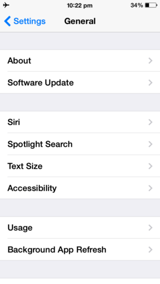
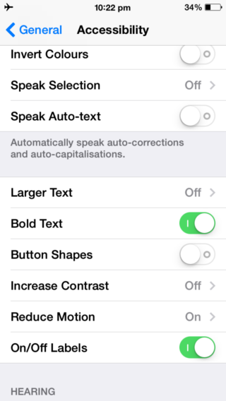
- Open the Settings app on your iPhone or iPad running iOS 7.1 or higher, and navigate to General > Accessibility

- Scroll down and tap on the “Increase Contrast” button

- Enable the “Reduce Transparency” switch

You should now see the transparency reduced, and the background of various elements like Control Center, Dock, Keyboard etc. turn opaque.

Home Screen: Reduce Transparency Off and Darken Colors Off (left), Reduce Transparency On and Darken Colors Off (Center), Reduce Transparency On and Darken Colors On (Right)

Folders: Reduce Transparency Off and Darken Colors Off (left), Reduce Transparency On and Darken Colors Off (Center), Reduce Transparency On and Darken Colors On (Right)
Here’s a video demo:
Reduce Transparency makes text on iOS a little more legible, but takes away blur, one of the signature additions of iOS 7. Let us know if you’ll be using this setting in the comments below.
Related:
- All the new features, improvements and refinements in iOS 7.1
- Tips to Fix iPhone or iPad battery life problems on iOS 7.1
- Confused with the iOS 7.1 keyboard? Here’s how to tell if Shift, Caps Lock is on or off
- How to access the event list view in Calendar app on iOS 7.1
- How to use Auto HDR on your iPhone 5s on iOS 7.1