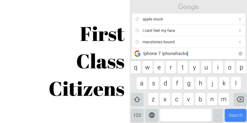
Now that two of Apple’s major competitors – Google (Gboard) and Microsoft (Word Flow) – both have third-party keyboards for iOS, it’s time to talk about their future.
With iOS 8, Apple shocked the world (well, the part of the world that cares about these things) by introducing Extensions. We had all agreed that was something Apple would never do. But Apple’s party hat wasn’t done. Out came the support for third party keyboards everyone just lost it.
It’s funny to see how the response has been – since then. It’s mostly just “meh”. Interesting keyboards would pop in, here and there. SwiftyKey was there on day one, of course (and it’s pretty good. SwiftKey was the reason a friend of mine was able to successfully switch from Android to iPhone). And there are about a thousand keyboards for sharing GIFs and emojis. But it never felt like custom keyboards were “taking off.” That was until recently.
had to. pic.twitter.com/2OmxTQoGym
— Khamosh Pathak (@pixeldetective) May 14, 2016
It was sudden, for sure, but it feels like custom keyboards for iOS have finally arrived. Despite Apple making it really hard for them to gain any kind of universal acceptance – like that other thing Apple popularized – apps.
But the thing is, the experience of downloading and using a third party keyboard is far worse than downloading and using a third party app.
Here’s how easy it is for a user to download and use an app:
- Find the app on the App Store.
- Hit the “Get” button.
- Authenticate
- Wait for it to download and there it is.
Here’s how “easy” it is for a user to start using a custom keyboard launcher.
All of the above plus:
- Go to some obscure place in Settings.
- Figure out a way to add a new keyboard.
- Add it.
- We’re not done. Now allow it full access.
- Authenticate/dodge a pretty scary sounding popup.
- We’re still not done. Now go to the keyboard, tap that “Globe” icon and switch to the keyboard.
All in all, a 10 plus step process.
So Much the Keyboards Can’t Do

And even after you’ve installed third-party keyboard, here are the things it can’t do.
- Access the default keyboard’s “press and hold to switch keyboards” popup to make switching easier.
- Any password fields.
- Can never be the “default keyboard”. So when you go back to a conversation in Messages, the keyboard you last used in that particular conversation will still be there.
- Can’t access the device’s microphone. Or the selected text.
- Can’t access other system settings like Auto-Capitalization, Enable Caps Lock, and dictionary reset feature.
Treat Them Like Apps, Not Extensions
What I want Apple to do in iOS 10 is look at all the kinds of crazy and amazing things developers are trying to do with the keyboard and understand that they’re not merely an extension.
I think it’s fundamentally wrong of Apple to bundle third-party keyboards with “Extensions” and artificially limit their APIs. Custom keyboards, the way they’re being built – are not just “extensions” for sharing one particular thing from one app to another.
Ben Evans says “the keyboard is a route into the phone – a run-time hidden in plain sight.” And I agree. It’s literally a new window into the user’s interaction. There’s a lot of chatbot talk going around but I think if the bot makers experiment with using the keyboard as their canvas, they might come up with some very interesting stuff. After all, chatbots only work in one (or particular apps), the keyboard is the same everywhere.
Make It Easy to Start Using Them
So they need to be as easy to install and use like apps.
Here’s the argument I’d like to make to Apple. When I install a third party mail app like Outlook, Apple doesn’t go a long way to making sure it’s not functionally inferior to the built-in Mail app. I know Chrome couldn’t use the faster browsing engine for a long time, and we still can’t add a third party app as default, but functionally, my experience of using Outlook is itself pretty great.
That’s what I want the keyboards to feel like. Not limited artificially by Apple’s APIs (both by performance and functionality).
Figure It Out
Easier said than done but I feel like Apple can figure it out. I’m sure there’s a way to respect the user’s privacy, as well as to improve the functionality.
To deal with the microphone access problem, Katherine Boehret at The Verge suggests that Apple could show the same green bar it shows when you jump out of a phone call, to show that a keyboard is listening.
Also, Do Something About the Keyboard Switcher
Every single keyboard has a different implementation of the keyboard switcher. When you’ve got half a dozen keyboards installed, the switching experience becomes frustrating. Because you have to cycle through every single one of them.
Your Wish?
What do you think should happen? Share with us in the comments below.