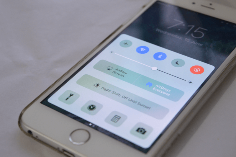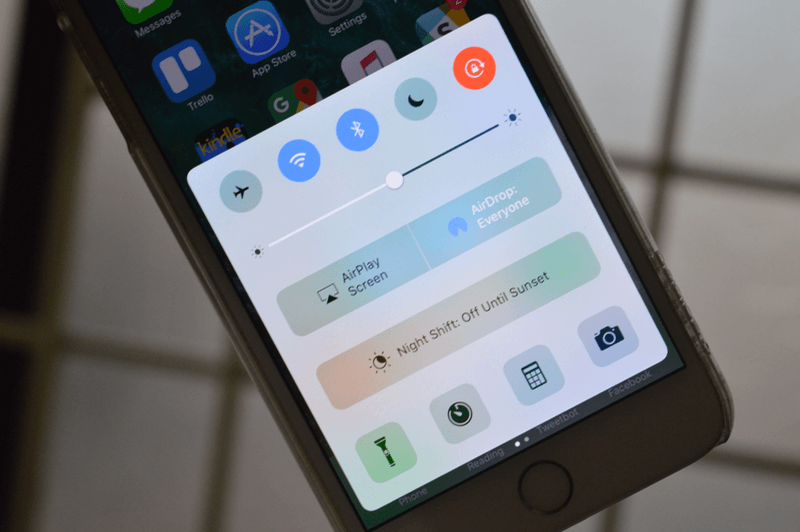
Ever since it was first released in iOS 7 back in 2013, Control Center hasn’t seen a major update other than some additions like Night Shift button. In iOS 10, Apple has put some thought into it and rearranged the living room, thrown in some new color and polished the furniture a bit as well.
Here’s everything that’s new in our friend from down under.
Control Center Is All Big

iOS 10 Control Center
Control Center got a redesign in iOS 10 and the first thing you notice is just how big everything is (this is a common theme in iOS 10, especially in apps like Music and News).
The buttons in the bottom are back to a foursome. The Night Shift button has been replaced by a row of its own (a bit unnecessary I think).

iOS 9 Control Center.
And the Music box has been taken out of this screen altogether (more on that in a bit).
And Colorful

When you tap on one of the toggles at the top, it changes color. It looks pretty cool. And they’re all different colors and they match the relevant icons in the Settings screen.
The “Airplane mode” icon turns yellow. Wi-Fi and Bluetooth both turn navy blue, Do Not Disturb takes purple and Orientation Lock is a big extreme with a bright red color.
And 3D Touchy

Good news: You can finally 3D Touch in Control Center.
Bad news: It’s limited to the four app related icons in the bottom of the screen – Flashlight, Timer, Calculator and Camera. Literally everything else is off limits to the 3rd dimension.

Flashlight Quick Actions popup lets you choose the intensity, the timer action lets you quickly set a timer for 1 or 5 minutes, the calculator action lets you copy your last result and the camera action brings up options to take a selfie, slo-mo, video or a photo.
And It Has Panes!
Wondering where that audio playback box went? Just swipe left. There’s an entire pane now dedicated to the audio playback.

And it looks pretty cool. Buttons are big and very easy to reach, so is the volume slider. All of it crammed in one screen before was a bit too much.
Also, from the bottom you can choose the output for the audio playback.

Another cool detail is how the artwork animates a bit – pulsates – when you play or pause. This is similar to the Music app’s redesigned Now Playing screen.
You Can Control Smart Home Devices From Control Center
Just like audio playback is a pane, there’s another one that controls shortcuts for all the smart devices you’ve got set up. This will only show up if you’ve set up the Home app.
This should solve one of the biggest annoyances with living the Smart Home life – just how complicated it is to control the “smart” devices with your phone.
Now, just swipe up from the lock screen and you can turn your lights on or off. You can also dim your lights and adjust temperature using a slider.
But It’s Still Pretty Much The Same

And that’s about it really. Majority of our wishlist for Control Center still stays just that. It’s not customizable, you can’t edit or replace or rearrange the toggles. Maybe next year?
Third Party Panes Maybe?
The fact that there are panes for audio playback and smart home controls makes me think that maybe, just maybe, Apple might allow third party developers to have their own panes. We haven’t heard anything about this yet so it’s just a speculation so far. More like a personal hope.
What Do You Think of Control Center?
What do you think of this tweaked and polished new Control Center in iOS 10? Share with us in the comments below.
Check out our iOS 10 coverage below:
- iOS 10 Hand-on: What’s New in Messages
- iOS 10 Hands-on: What’s New in Home Screen and Notification Center
- iOS 10 Hands-on: What’s New In The Lock Screen
- iOS 10 Hands-on: What’s New in Photos
- Top 44 iOS 10 Features for iPhone
- Top 25 Hidden iOS 10 Features
And also our macOS Sierra coverage:
- Top 11 macOS Sierra Hidden Features
- List of Macs compatible with macOS Sierra
- iOS 10 and macOS Sierra: Apple’s Ecosystem Stickiness Gets Stronger
- Safari in macOS Sierra will Automatically Deactivate Flash, QuickTime, and Other Plug-Ins by Default
- macOS Sierra References OLED Touch Bar and Touch ID for Upcoming MacBook Refresh