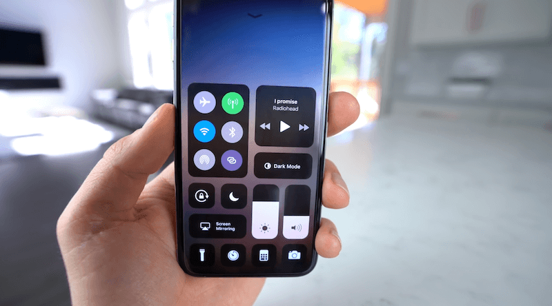
In iOS 11, one of our longest wishes came true with the new customizable Control Center. You could finally reorder, remove and add extra features to the Control Center. Granted, it was limited to the features Apple put in. Still, it was a good start. And we think iOS 12 is the perfect time to add third-party support for Control Center.
Everyone Gets Controls
With iOS 11, Apple turned Control Center elements into individual buttons. Some of them work as a simple on/off switch. Some of then give you a couple of options when you 3D Touch the icon. And some, like the Apple TV remote control, gives you a fully interactive canvas inside the Control Center.
And its the Apple TV remote control that’s the most inspiring. If Apple lets third parties create controls for Control Center, it would be a great way to access functionality without opening the app or even unlocking the phone. It could also serve as a faster way to access data in the app, similar to 3D Touch app shortcuts.
Real Toggles
iOS 11 has a weird behavior when it comes to Wi-Fi and Bluetooth. When you tap on the toggles, it doesn’t actually turn off the radios. It just disconnects from the current network. The next day at 5 AM, iOS will automatically reconnect to your preferred network.

This, of course, is annoying for anyone who wants complete control over their network. If you want to make sure Wi-Fi won’t reconnect in the morning and start flooding you with notifications, you need to go to Settings and flip the switch from there.
Apple can implement a feature where a single tap disconnects the network but then a second tap can actually disable the toggle altogether.
Toggles Lead to Settings

It would be great if 3D Touching a toggle opened the relevant section directly in Settings. Just for the Bluetooth page, this would be worth the addition for many.
Alternatively, 3D Touching toggles could bring a popup menu similar to the Now Playing widget. This way, we could switch to a different Wi-Fi network or a Bluetooth connection without going to the Settings app. This is something that Android has had for years.
Control Center Placement on iPhone X

On the iPhone X, you need to pull down from the right ear to access Control Center. I’ve used the iPhone X for 6 months now and I’m still not used to this gesture. It still feels like it’s bolted on.
Apple needs to think of a better place to put the Control Center in iPhone X. Merging Control Center and multitasking would be a sensible thing to do for most users.
Check out the other features that we’d like to see in iOS 12
- iOS 12 Wishlist: iPhone X Improvements
- iOS 12 Wishlist: Siri Feature Parity and Extensions Overhaul
- iOS 12 Wishlist: iCloud Overhaul And More Free Storage
- iOS 12 Wishlist: A Better Notification Center
- 10 Features We Want in FaceTime and Messages Apps
Your Ideas
How do you want to change Control Center in iOS 12? Share with us in the comments below.