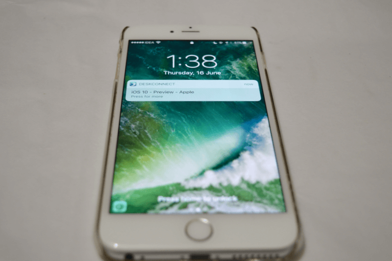
I have to say, one of the biggest changes in iOS 10 is staring you right at your face the minute you pick up your iPhone or iPad. The lock screen experience has been completely rethought. Almost everything on the screen is new (even the timestamp is bolder). There’s just so much to talk about. So let’s get to it.
Just Pick Up Your Phone To View The Lockscreen
Because the second-generation Touch ID sensor in newer iPhones is so fast, people were missing seeing their lockscreen notifications when they clicked the home button to view the lockscreen. They’d end up straight at the homescreen.
To deal with this problem, iOS will now light up the display and show you the lockscreen the second you pick it up. So far I really like just holding my phone up to see the new notifications I’ve got.
You No Longer Slide To Unlock
Apple has replaced the iconic Slide to Unlock gesture in iOS 10 with a simple “Press home to unlock” text at the bottom of the screen.

iPhone users with Touch ID are already used to pressing the Home button to unlock the device so it does make sense to go with this as the default.
The only thing is, iPhone 5, 5c and iPad mini 1 and 2 users will need to get used to pressing the home button to unlock the device. Also, even when you set up a new device, you’ll have to press the home button to start.
This Means, The Only Way To Unlock Your Phone Is By Pressing The Home Button
I’m having problems getting used to this. I would usually turn on the lock screen using the power button and merely put my finger on the home button and it would unlock the device.
But in iOS 10, no matter if your screen is turned on or turned off, you’ll need to press the home button. It’s just going to be some time getting used to it. Also, there’s no way to directly get to the Passcode screen if you have Touch ID enabled. It only works as a fallback – if Touch ID doesn’t work for 3 times or when you reboot your device.
Notifications Look Like Cards

In all past iterations of iOS, notifications looked like a list.
But now they look like cards. They have this creamish, translucent background and spacing in between notifications. These cards are going take up a lot of space. But this is not just change for change’s sake. There’s a very good reason for each notification being a card.
Also, you’ll notice that the wallpaper is no longer blurred when you get notifications (it is when you’re looking at music playback preview on the lockscreen).
Notifications Are Interactive
This is one of the biggest changes in iOS 10.
If you have an iPhone 6s or iPhone 6s Plus, you can press deeper on the card to view a bigger preview of the notification, and some actions (if you don’t have a device with 3D Touch, simply long press). So in a notification from a Mail app for example, you can archive an email right from the lock screen.

But it doesn’t stop there. In apps like WhatsApp and Messages, when you press deeper, you’ll get an option to reply to the message. And in if it’s a Messages conversation, you’ll even see a preview of the conversation on the top. And see when new replies come in. So basically, if the app supports it, you can have an entire conversation without ever opening your phone.
But as this is Apple, you’ll need to authenticate with Touch ID before you can actually reply.
Proactive Screen and Widgets On Left

Another big change? Swiping your finger to the right now brings up the Proactive screen. And this screen contains all your widgets (they’ve been removed from Notification Center).

This means you can do a Spotlight search (currency conversion or any kind of look up), view Siri suggestions for apps, call your favorite contacts, read news, and view and interact with all your widgets right from the lockscreen. This is going to be such a big time saver.
Same as the notification, you only need to authenticate with Touch ID when you interact with some element.
Camera on Right
The gesture for opening the Camera has been changed to swiping left on the lock screen. The Camera now slides in smoothly from the right edge of the screen.
Your Favorite Feature?
What’s your favorite feature in iOS 10? And what’s the thing that’s annoying you the most? Share with us in the comments below.
Read: Top 35 iOS 10 Features | Top 25 Hidden iOS 10 Features and Changes